Published
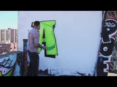
Watch more How to Draw Graffiti videos: http://www.howcast.com/videos/495500-How-to-Draw-a-B-GraffitiLearn how to draw the letter A in graffiti from graffiti artist Paes 164 in this Howcast video.My name is Paes164 and I'm a professional artist. I've been painting since a teenager, and I've been doing it for 20 years now. Find me at Paes164.com (p-a-e-s-164.com) My Facebook is facebook.com/paes_art. So, i'm going to start off with the letter A. We're going to do, little bit of a bubble letter check it out. This is basically just used to get your name up on the street. Something fun and fast. You basically just want to do something that you don't have to stop spraying. Its usually something you're doing quicker. Also, a little 3D to kinda just bold up the letter helps a lot. Just like that is a letter A. So, with a block buster, really self explanatory, it's a big blocky letter that once again, everyone is going to be able to read from a block away. Kinda come through with the initial color of your letter and just do your rough sketch of however you want to line it out, just something really legible. Now again with a blockbuster, its not so much about, you know, your details or your piece but more about just getting those letters up and letting people read it. Now, with some black or any type of darker color we're gonna come and outline it. After outlining it we're gonna come in and trim it off with a little bit of 3D to make the letters pop out some more. So, kinda just following around like a shadowbox around the letters. Off to one side. Ok, and that's the blockbuster letter A. Again, kinda just starting with your sketch, but its really just taking that initial letter and twisting it out and giving it your own personality and style.And any color can, you wanna sketch with is fine. Just about right there, we're gonna start with our sketch of the A. You can see, unlike the throw up and the blockbuster its just a couple more twists but ultimately it's still the letter A. Color choice is always up to you. To make your letters stand out good, you should always mix a combination of dark and light. Before you come back and add your outline, now's a good time to add any cheesy details to make your letters stand out. When coming and doing your outline, you're kinda coming in and cutting against the lines of the letter that you shaded just to kinda clean it up and touching it up with the outline, followed by inner gel will make the letter pop. So we're going to move on to adding a little bit of 3D, once again its all about making those letters pop, and making peoples jaw's drop. What?! Next step, back to the inner outline known as the inner gel. Basically you want to go with the brightest color of the grouping colors you're going to use for this piece just to kinda give it that edge and that pop, and that graffiti look. Lets make our wild style look that much cooler, we're going to add a outer outline known as the "outer gel". There you have it, wild style A.
- Category
- Arts
Sign in or sign up to post comments.
Be the first to comment
Up Next
Autoplay
-
03:18

How to Draw a B | Graffiti
-
03:12
How to Draw a W | Graffiti
-
03:13
How to Draw a K | Graffiti
-
02:53
How to Draw a Y | Graffiti
-
03:01
How to Draw a G | Graffiti
-
03:02
How to Draw a T | Graffiti
-
03:24
How to Draw an M | Graffiti
-
03:25
How to Draw a D | Graffiti
-
03:23
How to Draw a P | Graffiti
-
02:49
How to Draw a J | Graffiti
-
03:15
How to Draw an X | Graffiti
-
03:15
How to Draw an F | Graffiti
-
01:20
How to Draw Graffiti with Paes 164 | Graffiti
-
03:28
How to Draw an I | Graffiti
-
03:12
How to Draw an L | Graffiti
-
03:25
How to Draw a Z | Graffiti
-
03:26
How to Draw an N | Graffiti
-
02:48
How to Draw an S | Graffiti
-
03:23
How to Draw an O | Graffiti
-
03:12
How to Draw a Q | Graffiti
-
02:57
How to Draw an R | Graffiti
-
03:19
How to Draw an H | Graffiti